The changing digital landscape dramatically changed the way presentations are delivered and consumed. Presentations are no longer static, one-way communications; they have become dynamic and interactive. Hence, using data-driven approaches to presentational enhancement has become critical for optimizing audience engagement. Presentation analytics, that is, trends or ways of enhancing the effectiveness of presentations via data collection and analysis, points out the need for its integration with innovations.
Here, we are going to find out the trends most important in presentation analytics and how you might use these insights to make audience engagement improve.
1. What is Presentation Analytics?
Presentation analytics collect data on how your audience engages with your presentation, but serve this data to enhance the engagement for them. This might include metrics on how many minutes they dwell on each slide, whether they tend to drop off and on which parts they elicit the most engagement.
Traditionally, it had to rely on subjective measures of review and rarely drew much feedback from the audience. Today, data-driven environments mean businesses can rely on concrete metrics and detailed insights to measure and optimize presentation performance. This is particularly good when attempting to know where the audience’s interests dwindle or which sections best drive home a point.
2. The Growing Importance of Audience Engagement
Perhaps the very best predictor of any presentation’s success is audience engagement. The attention of an audience much more frequently and deeply carries out the learning derived from the information presented. For this reason, business and professionals alike look for ways to enhance engagement through new techniques such as harnessing presentation analytics data.
With the popularity of virtual presentations, the attention span of the audience has shrunk to smaller spans. That’s why it becomes even more important to monitor their engagement in real-time and make the necessary adjustments while holding their attention. The silver lining is that analytics tools provide the useful insights that include where people are likely to drop off and which slides perform best, so presenters can make informed changes to the overall experience.
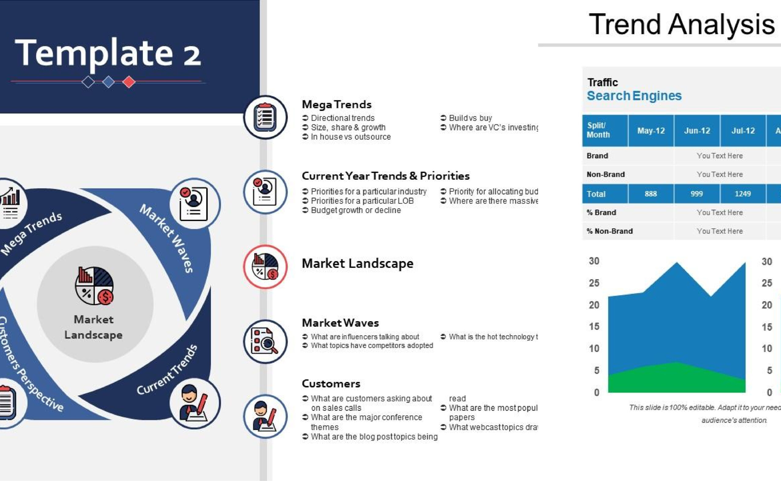
3. Key Metrics in Presentation Analytics
To really optimize audience engagement effectively, you need to zero in on the right metrics. And here are some of the most critical data points used in presentation analytics:
- Slide Engagement: Measures the time viewers are spending on every slide and identifies which slides are getting the most attention.
- Audience Drop-off Rates: This specifies where viewers leave the presentation, which would indicate areas that may be problematic.
- Interaction Data: It follows the clicks, comments, or responses to the polls, quizzes, or questions placed inside the presentation.
- Slide Sharing & Downloading: This indicates parts of the presentation being shared or downloaded and therefore reveals the points of interest from the audience.
Through these metrics, one can derive actionable recommendations that show one’s performance in their presentations and which are areas to work on for further enhancement.
4. Applying AI in Presentation Analytics
One of the most exciting trends about presentation analytics is how AI facilitates the interpretation of engagement data and improvements. AI tools can process large datasets fast and track patterns and trends that would be very hard to track down manually. What’s more, AI-enabled platforms can also recommend how users can optimize the flow of content, and slide design, and even make audience-specific adjustments.
An AI presentation maker, for instance, can be very useful in easing the process of creating a presentation, while such tools add much more precision analytics to help track performance. These sites and platforms easily create visually enhanced presentations and data-driven ones to ensure an efficient engagement process.
AI presentation maker software avails the simple method of creating presentations while collecting data on the behavior of the audience. With such a concept, businesses can correct their presentations in real-time, which ensures the message preached resonates with the target audience.
5. Data-driven Presentations
It’s a buzzword that has been resonating well across many industries and is finding its way into presentations. From analytics, it would be possible to design customized presentations based on audience behavior, interests, and engagement levels. This is particularly valuable in sales, marketing, and educational sectors wherein tailoring content to the individual yields sure results.
For example, when your data indicates that a certain segment of audiences
This means that the knowledge you gain now may be used in the future to give a more picture-driven presentation for that audience. On the other hand, if you have slides that never fail to send audiences running, you’ll probably edit the content or how you deliver it to make it interesting.
6. Interactive Elements and How They Impact Analytics
Live polls, quizzes, and Q&A sessions are fast becoming popular in presentations as the interactive elements that capture the audience’s attention. Interactive elements not only better engage the audience but also yield valuable data for analytics. It becomes easy enough for presenters to note topics that resonate most with the audience and topics require more clarification when analyzing the responses from the audience about interactive elements.
These kinds of interactivity can also help prevent audience fatigue; hence it is possible to maintain the audience’s interest during prolonged presentations. Additionally, interaction data adds further context to presentation analytics so you can keep honing your technique.
7. Live Feedback to Responsiveness in Presentations
The latest trend in presentation analytics has seen the real-time feedback tool: gathering audience data while a presentation is being presented, thus allowing a presenter to change around in real time. For instance, if the analytics show that audiences are dropping off midstream during this presentation, then a presenter can actually adjust delivery or content focus to regain the audiences’ attention.
It is very useful in live virtual events where there is always a natural loss of engagement that transpires through the time interval. Content can be altered on the fly from real-time data, so the presenter can keep on engaging the audience until the very end.
8. Video Integration and Analytics
Video is being increasingly used in presentations these days with better analytics on video engagement, which makes things more complex. Videos can be good ways of communicating difficult concepts in lesser amounts of time, but they would do so only if planned out well so that the audience stays attentive throughout.
They can personalize their video presentations by monitoring how long the viewers view and whether they actually engage with that portion of the content using analytics. If that’s a poorly engaged part of the video, then it would be wise to shorten such videos or perhaps integrate more interactive elements.
Analytics can also be added in video presentations. This can be very useful for creating an explainer video as explanation of products, demonstrations, or even education. For instance, you can make an explainer video, where analytics show which parts of the video keep the viewers glued and parts that need more fixing in order not to disengage the viewers.
9. Optimization of Presentation Structure Using Analytics
Presentation analytics also tells you how the structure of your presentation impacts engagement at certain numbers, whether or not people are losing interest at a certain number of slides. Perhaps it’s because your presentation is too lengthy, or those sections need to be condensed. Shorten it, or add breaks, and people will retain everything they have heard.
In the same way, if some sections of the presentation rock, you might extend some of the areas in future presentations. Here, the challenge is to translate the data into improving your structure and making it more engaging for your audience.
Conclusion
Presentation analytics is revolutionizing the way we put together and present presentations. Now because it uses true engagement metrics, AI tools, and personalized content, presenters can craft data-driven experiences that will be engaging, even from the very beginning to the very end. Whether it’s a simple explainer video or a complex sales pitch, always using analytics enhances a presentation and brings better outcomes.
Read more: Where Is Medvedev From? Exploring the Background and Roots of Tennis Star Daniil Medvedev